Why the Font Matters More Than You Think
A child's name on the wall is more than decoration. It's a daily statement about who that room belongs to. The font you choose shapes the entire room's emotional tone. A flowing script feels romantic and dreamy. A bold block letter feels confident and grown-up. A whimsical hand-lettered style feels playful. Same name, completely different rooms.
This is the most underrated decision parents make when ordering a personalized decal. Color and size matter, of course. But the font is what makes a name decal feel like "Sofia's room" instead of just "a room with the word Sofia on the wall." Here's how to choose the right one for your child and your space.
“The font is what makes the room belong to your child — not just the name.”
Script Fonts: Romantic, Flowing, Timeless
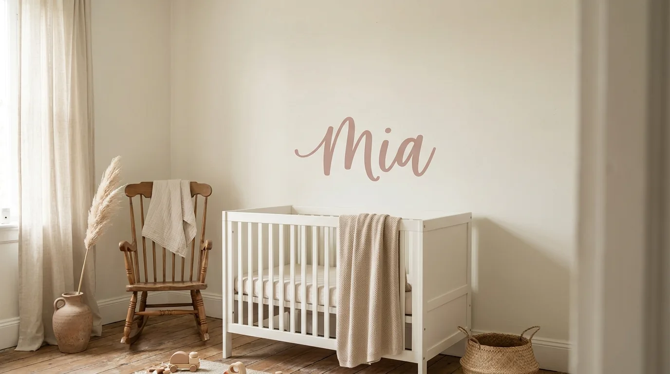
Script fonts (also called cursive or calligraphy) flow with connected letters and graceful curves. They evoke handwriting, intimacy, and care. For nurseries and rooms designed to feel calming and warm, script is almost always the right choice.
Modern script (clean curves, even letter weights) suits Scandi-style interiors and works beautifully in dusty pink, sage green, or warm beige. Vintage script (more ornate, with flourishes) pairs well with floral themes, gallery walls, and rooms with romantic palettes. Hand-lettered script (slightly irregular, like real handwriting) feels personal and contemporary, especially for rooms that mix earthy tones with vintage decor.
Block and Sans-Serif Fonts: Bold, Modern, Easy to Read
Block letters are bold, sans-serif, and built with even strokes. They feel confident, clear, and modern. They're the safest choice for children old enough to read their own name, because the letters look like the ones in their early reading books. A child sees their name on the wall in the same shapes they're learning at school, and the room becomes a small daily affirmation.
Sans-serif fonts (without the small "feet" at the end of strokes) read easily from across the room. They suit space themes, geometric rooms, sports themes, and any room designed with a more grown-up aesthetic. Serif fonts (with small classical "feet") add a touch of tradition. They pair beautifully with mountain murals, library-style reading nooks, and rooms with darker, moodier palettes.
“Kids read their own name first. The font on the wall should match the books on the shelf.”
Decorative and Themed Fonts: When Personality Matters
Decorative fonts amplify a theme. A unicorn-styled font with curling flourishes belongs above a rainbow scene. A futuristic space font with angular letters belongs near a rocket and planets. A jungle-themed font with leafy serifs belongs in a safari room.
Use these sparingly. Themed fonts are the loudest visual choice. They only work when the rest of the room actively supports the theme. A unicorn font on a wall otherwise decorated with neutral mountains will feel disconnected. The rule of thumb: if you can describe the room in one word (safari, unicorn, space), a themed font enhances it. If you can't, choose a script or block font instead.
Color Choices That Pop (and Some That Disappear)
Color contrast is what makes a name decal readable from across the room. The biggest mistake parents make is choosing a color that looks beautiful on the website but disappears against their actual wall. White vinyl on a light gray wall is gorgeous in catalog photos and nearly invisible in real life.
Before committing, check the contrast level between the decal color and your wall color. As a starting rule:
- On white or cream walls: navy, terracotta, deep sage, charcoal, or any saturated color reads strongly
- On light pastel walls (mint, blush, sky blue): black, deep navy, or charcoal stands out cleanly
- On dark or moody walls: white, soft cream, blush, or metallic gold reads from any angle
- Avoid: light vinyl on light walls, dark vinyl on dark walls, or any combination where the contrast feels muted across a 10-foot viewing distance
- For two-color name decals (rare but stunning): combine a high-contrast outline with a softer fill color
“Contrast is what makes a name decal readable from the doorway.”
Sizing Your Name Decal Correctly
Size depends on three things: the length of the name, the wall it will live on, and how far back you stand when you look at it. A three-letter name like Ava or Leo needs much less wall space than a six-letter name like Jonatan or Mariana. The same physical width can look generous for one and crowded for the other.
A few reliable starting points by placement:
- Above a crib (centered): 20 to 32 inches wide reads beautifully without overpowering
- Above a twin or single bed: 32 to 48 inches wide
- Above a queen bed or as a feature wall: 48 to 72 inches wide
- On a door or above a window: 12 to 20 inches wide
- Sibling rooms with multiple names: keep each at 20 to 28 inches and align them vertically
Combining Names with Themes (Without Visual Chaos)
The most common visual mistake on personalized rooms is doing too much. A safari scene on the wall. A name decal in a jungle font with vines wrapping the letters. A banner across the door. Decorative letters spelling the child's name on the dresser. Every individual piece is beautiful. The room collectively feels chaotic.
Choose one focal point. If the wall scene is the hero, keep the name in a simple, neutral font that lets the scene breathe. If the name is the focal point, simplify the surrounding decor and let the name carry the room. The most photographed kids rooms on our customer wall almost always have one big personalization moment, not five small ones. Pick the moment that matters and make it count. Browse our custom name decal collection to start designing yours.
“One big personalisation moment beats five small ones — always.”